A Reels ad runs fullscreen, and Meta draws its own interface on top of the creative. The profile picture and the sound control sit over the top of the frame. The account name, the caption and the call-to-action button sit over the bottom. Anything you put underneath is still in the file, it just isn't readable on a phone.
So the file is 1080 x 1920, and the part you can actually design into is a good deal smaller.
These are the paid numbers. An organic Reel carries a different set of controls and no CTA button, so the two are not interchangeable - and because the ad layout is the more crowded of the two, the ad zones are the safer set of guides to hand a team producing both.
The safe area, in pixels
Keep text, logos and anything else carrying the message out of three regions:
- the top 14% of the frame
- the bottom 35%
- 6% down each side, where edge cropping varies between handsets
At 1080 x 1920 that leaves a box running from x 65 to x 1015, and from y 269 to y 1248. Call it 950 x 979 px, sitting slightly above centre - a bit over half the frame. The percentages are what matter if you work at another resolution: top is 0.14 x height, bottom is 0.35 x height, sides are 0.06 x width.
Designers set up guides in pixels rather than percentages, so give them the numbers in the brief. It is far easier to build inside the box than to rescue a layout that ignored it.
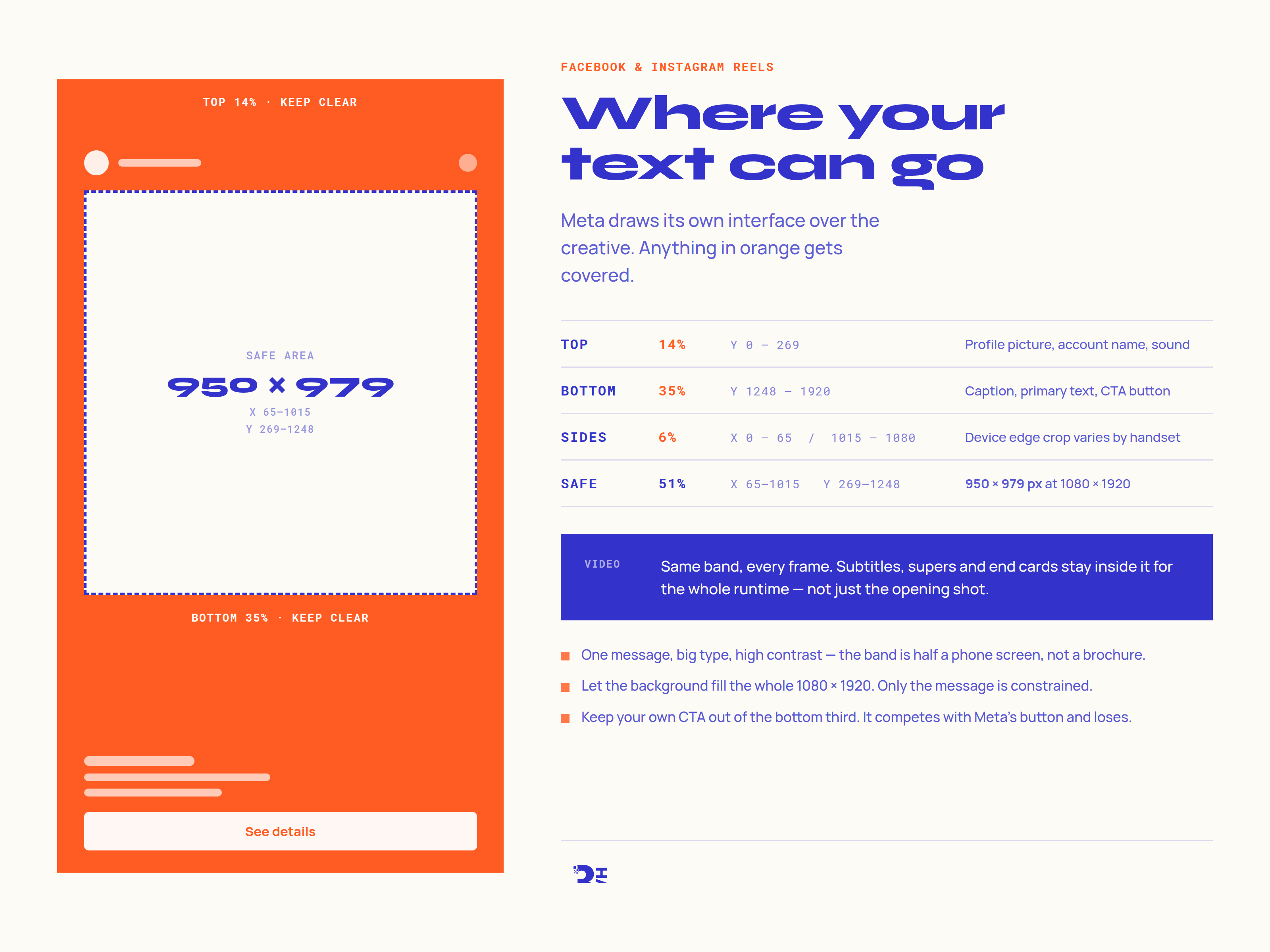
Video is where this usually goes wrong
A static gets checked because there is one frame to look at. Video often doesn't. We've seen subtitles sit neatly in the band for the opening shot and then drift down into the bottom third for the rest of the runtime, and an end card that put the offer squarely behind the See details button.
The band applies to every frame, not just the first one. Scrub the whole thing before it goes near an ad set, and check it in the Ads Manager preview on the Reels placement specifically - the desktop thumbnail will not show you the problem.
The background is not constrained
Only the message has to live in the band. Your background image or footage should fill the whole 1080 x 1920. A letterboxed 1:1 square with bars top and bottom reads as a repurposed feed post, and it usually is one.
Two things to watch in the area Meta occupies. Pale or busy artwork behind the white username and caption text makes both hard to read, which lands on you rather than on Meta. And your own call to action wants to stay well clear of the bottom third, because it ends up competing with the real button.
A cheat sheet to hand over
Download the Reels safe zone cheat sheet (PDF, one page) - the zones, the pixel numbers, the static specs and the checks to run before launch. Print it, or send it to whoever is cutting the video.
If it would help to have the creative built to the placement from the start, that is what our ad creative work covers, and the same box applies across the Facebook and Instagram placements that run fullscreen.